top of page
Nick
Anglin

BEHANCE
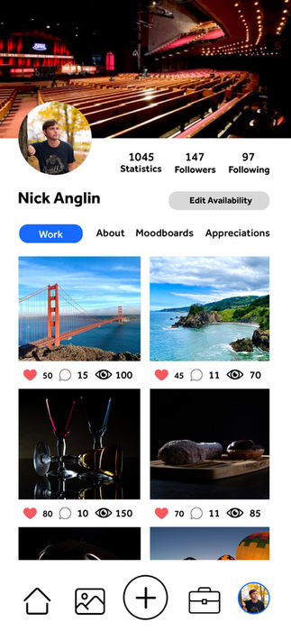
If you’ve ever used Behance’s mobile interface, you may have noticed that the user experience can feel somewhat clunky and unintuitive. For this redesign, my goal was to create a more seamless and engaging UI that enhances both navigation and content discovery. I drew inspiration from the clean, visual-forward layouts of Instagram and Pinterest, as both platforms excel in presenting creative work in an accessible and scrollable format.
bottom of page


